SCA
Specialty Coffee Association was looking for a bold and fresh rebrand for their 2026 World Coffee Championships events. I delivered two concepts that were both vibrant and universal.
Role: Design Director
Focus: Identity, Campaign
Year: 2025
Concept 1
"Universal Connectors"
With the World Coffee Championships taking place across several countries and requiring a wide swath of deliverables, I kicked off the first concept with a mood-board that centered around five key inspiration words: Universal, Minimalist, Bold, Friendly and Inclusive.
Creating an identity that could be understood everywhere and would work on both large and small scale was critical.


The Thought Starter
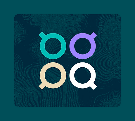
These competitions are about the people that make it all happen. Keeping with our Bauhaus-esque concept, I molded simple shapes to resemble a person with a coffee cup.

The Mark
To bring the competition element more to the fore, I created a pattern from the thought starter shape so the mark resembles a group of people. It’s also a subtle nod to coffee drips and bubbles.

The Logo Lockup
To finalize the lockup, I paired the mark with a sans serif font that has a nod to both retro and modern. With everything combined we have a bold, timeless lockup that sets the tone for the rest of the identity.
After the mark and logo lockup were established, I applied the look and feel to the three cities that would be hosting the events, each unique with their own color palette.

Brussels Lockup

Bangkok Lockup

San Diego Lockup


I then compiled a library of motifs and patterns that could be utilized across all deliverables. Some of these were general, meaning they could be used across locations, and some were location-specific.


Once the themes for each city were established, I transferred the identities on to social posts, print, and merchandise to complete the Universal Connectors concept.


Concept 2
"Fluid Forms"
The Fluid Forms concept had five key inspirations, which included: Movement/Fluidity, Adventurous, Texture, Vibrant, and Worlds Collide.
Keeping with our Bauhaus-esque and simplified shapes mantra that ran across both concepts, I wanted to infuse some ‘chaos’ into the standard shapes. This chaos is what occurs naturally within coffee, like swirls of cream being added to a cup of black coffee, for example.

The Thought Starter
Keeping with our simplified shapes mantra, I thought about how we could create a coffee cup silhouette based off of purely circular shapes.

The Mark
Building off our thought starter shapes, I stacked three coffee cups atop each other to symbolize one for each host location.

The Logo Lockup
To finalize the lockup, I paired the mark with a heavy sans serif font that’s as bold as the mark. The sturdiness of this lockup ensures that it provides grounding for the more abstract elements seen in the rest of the identity.
After the mark and logo lockup were established, I applied the look and feel to the three cities that would be hosting the events, each unique with their own color palette.

Brussels Lockup

Bangkok Lockup

San Diego Lockup


I then compiled a library of motifs and patterns that could be utilized across all deliverables. Some of these were general, meaning they could be used across locations, and some were location-specific.


Once the themes for each city were established, I transferred the identities onto social posts, print, and merchandise to complete the Fluid Forms concept.


